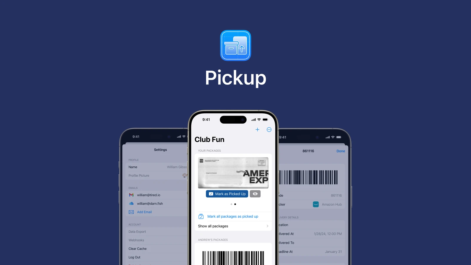
Pickup brought parcel locker codes into a shared household, so the person collecting a delivery could find the code without waiting for someone else to forward it.
My role covered brand and art identity, and product design. I collaborated with my friend William Gibson for three months in 2024. The iOS app reached an invited beta and is now discontinued.
Overview
A delivery belongs to one person. Picking it up can be shared.
Locker codes arrive in individual inboxes, but the person who ordered a package is not always the person available to collect it. Pickup was built around that small coordination problem between people who live together.
William asked me to handle the brand and art identity. Our collaboration grew into shaping the app's setup and delivery screens: creating a home, connecting delivery emails, and bringing a code within reach when a package arrives.
Solution
Connect the household before the deliveries.
The setup offers two starting points: create a home and invite others, or join a home someone has already created. From there, someone selects a parcel provider and an email provider before following instructions to set up email forwarding.
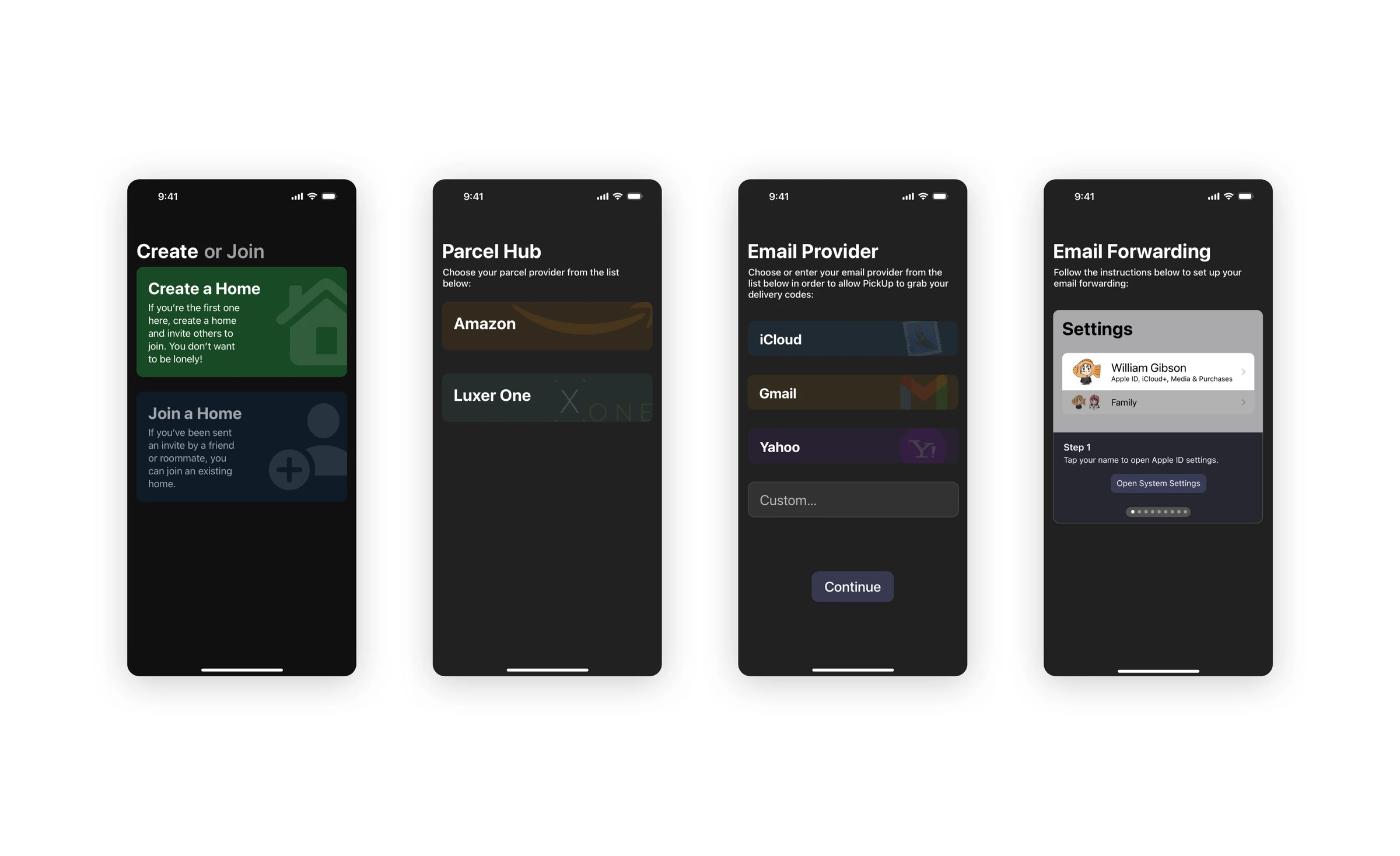
The setup moves from household membership to the services that send delivery codes. Email forwarding has its own illustrated steps.
Put the code where the pickup happens.
The delivery notification includes the pickup code. An expanded notification shows a barcode, while the household view groups packages by person and offers controls to mark them as picked up. The experience connects receiving a delivery with collecting it, rather than stopping at another arrival alert.
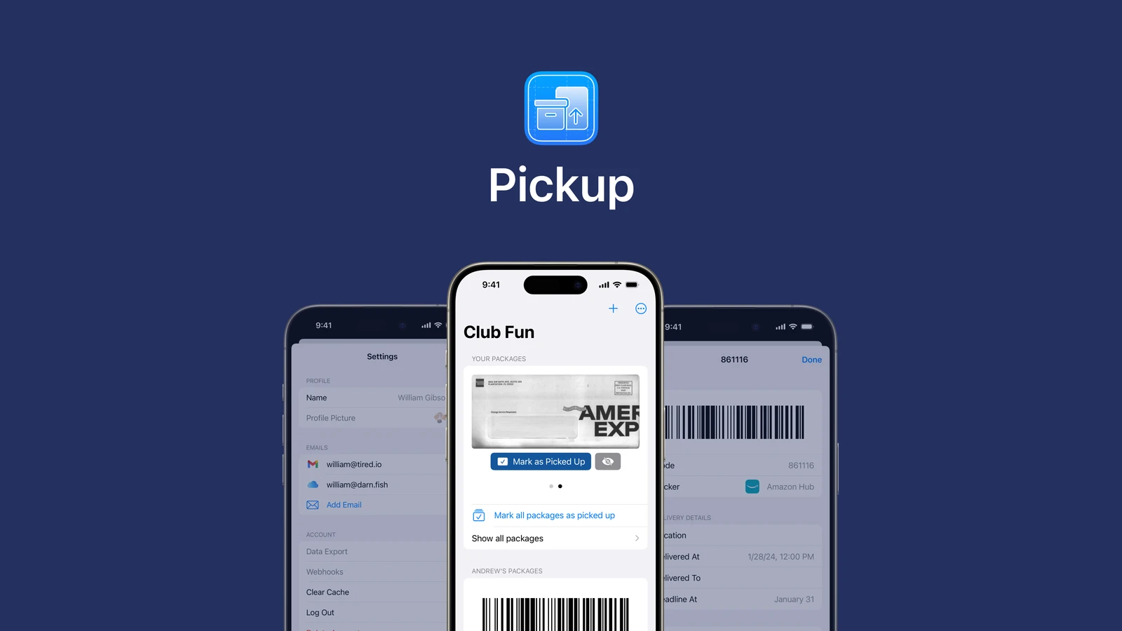
The household view keeps packages together while identifying who they belong to. Collection controls sit with each package.
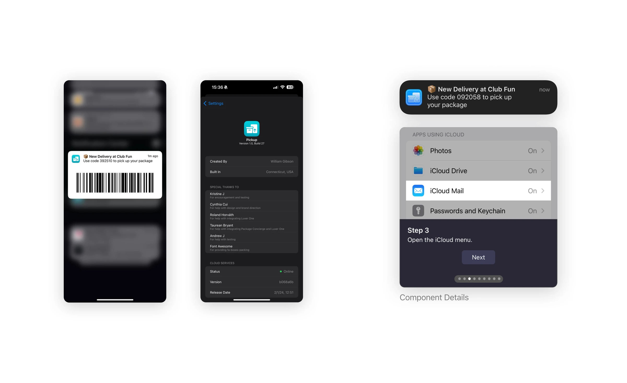
The notification exposes the collection code. The forwarding guide uses screenshots of system settings to show where the next step happens.
Research
Work from the coordination flow, then ask where it breaks.
The surviving project outline maps the experience from household setup through delivery and collection. It also proposes batching notifications for other household members, so a shared delivery system does not have to interrupt everyone for every package. These are design intentions; the outline does not document interviews or establish how often households encounter the problem.
If I returned to the project, I would start with qualitative observation of how households currently share locker codes. I would choose that over an initial survey because the handoff matters: who receives the email, who goes downstairs, and where they need to ask for help. A later task test could pair those observations with completion rates and errors during setup and collection. That mixed approach would help distinguish a useful household habit from a flow that only makes sense to us.
Process
Separate joining a home from connecting an inbox.
The final screens distinguish creating and joining a home before asking about parcel and email providers. That order gives the setup a shared destination first. The provider choices then narrow the instructions someone needs to follow.
The forwarding guide breaks a task outside the app into individual steps, with a settings screenshot and a visible progress indicator. This makes the next action concrete, but it also exposes the main tradeoff: a convenient delivery code depends on setup that takes someone through their email settings.
The project outline leaves open how to support providers beyond the named options; the final email screen includes a custom entry. I would next compare the guided provider paths with that custom path to see where instructions become too vague. The saved material does not preserve earlier prototypes or a comparison of rejected designs.
Reflection
Test the setup cost against the everyday benefit.
The project left me with a question about the scale of the problem. How many shared pickups would make the initial setup worthwhile? A code at the right moment is useful, but the benefit has to be enough for a household to connect their inboxes and keep using the app.
I would want to understand that before extending the design. The collaboration gave us a beta and a coherent set of screens; sustaining a service needed more interest and time than we had available.