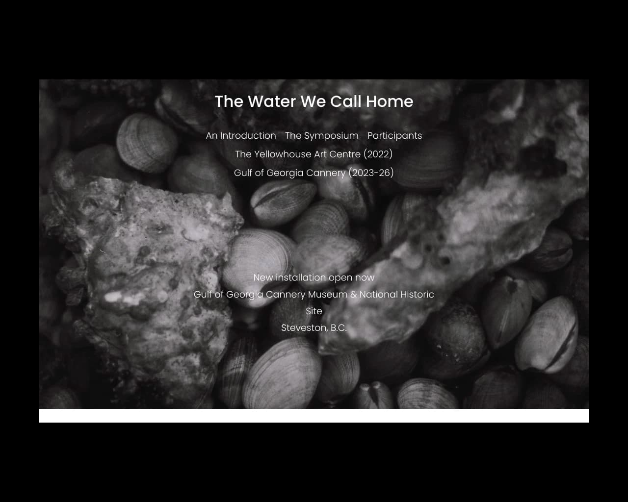
The Brief
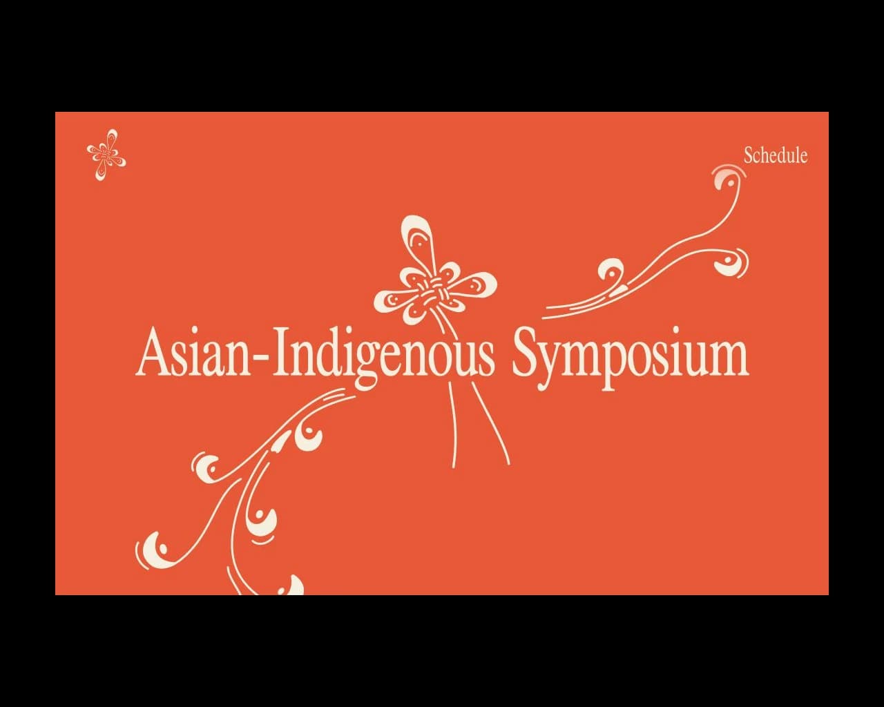
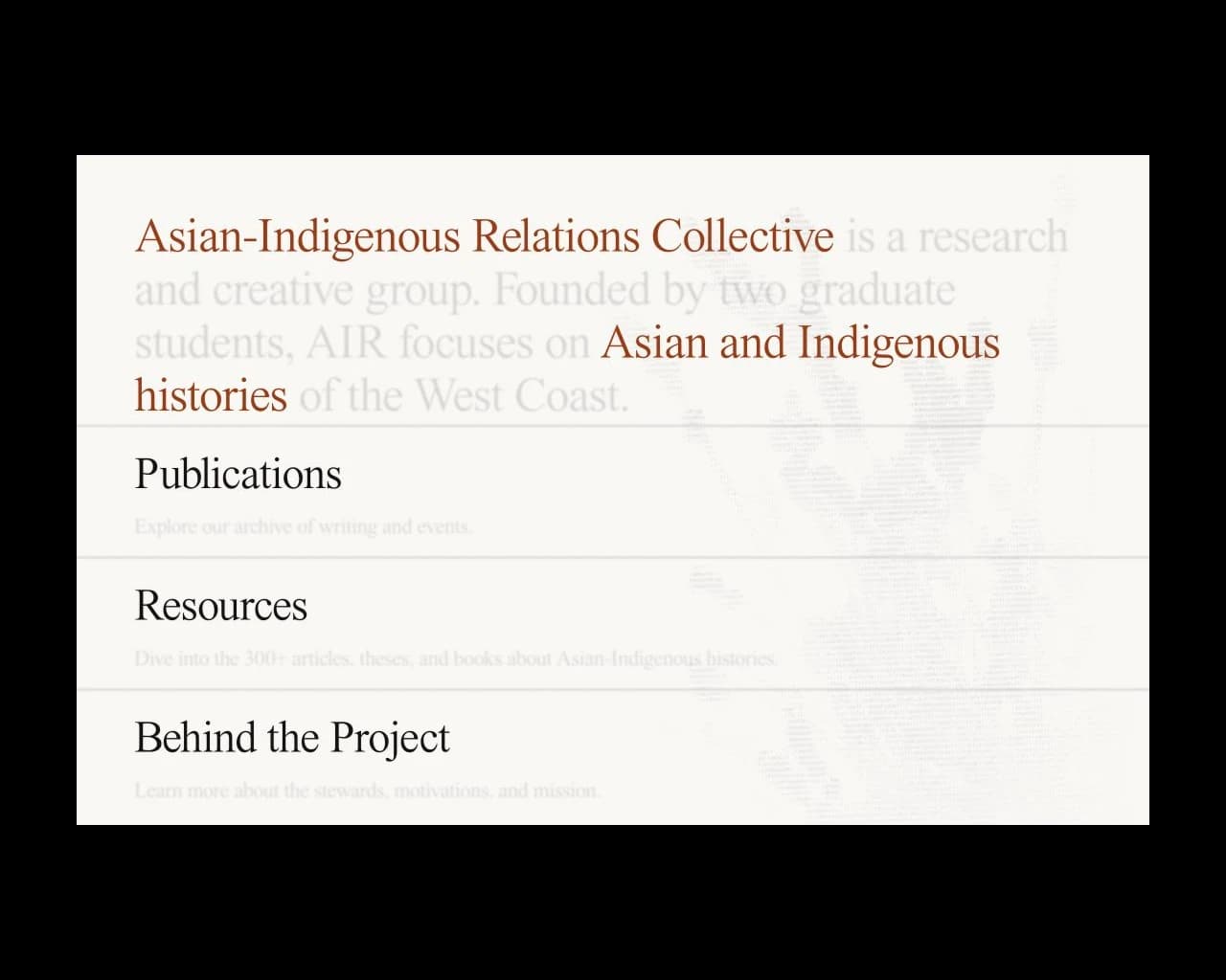
The Asian-Indigenous Relations Collective, or AIR, is a Vancouver organization working across the Downtown Eastside and Chinatown to share and teach the history of Asian and Indigenous communities. In September 2025, AIR held "The Past, Present and Future of Braided Solidarities," the largest national conference on Asian-Indigenous relations to date.
As creative director, I led two visual designers, a UX/UI designer, and a developer. We designed the conference website, lanyards, brochures, and posters. The identity needed to help people find information while expressing what the conference was about.
The Problem Space
The conference brought Asian and Indigenous communities together. Our identity needed to express solidarity and interconnection without losing what was distinct about either community. Putting elements from each culture next to one another wouldn't be enough.
Mood Board
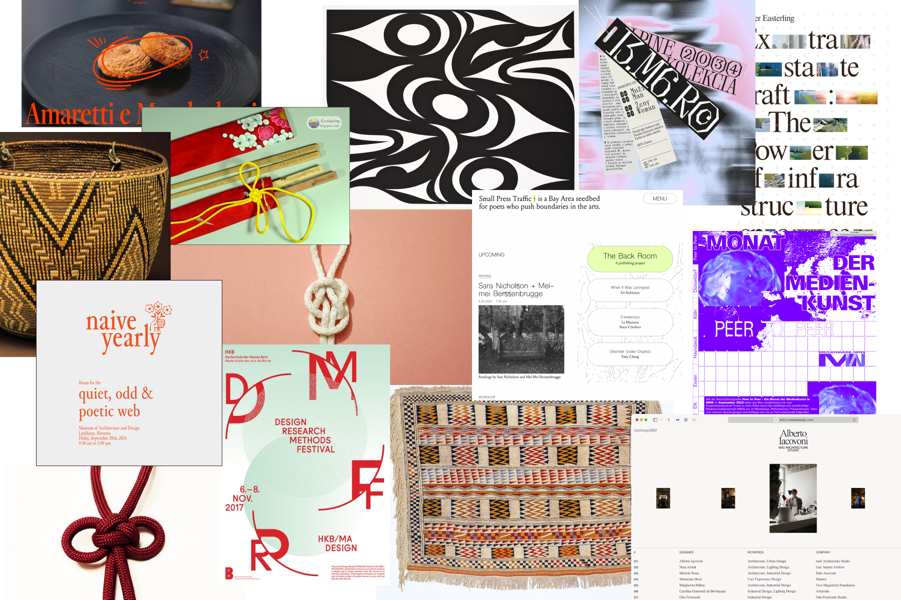
I started by gathering visual references for the event. I had room to set the direction, and I wanted interconnectedness to guide it. We built on AIR's existing design system so the conference would remain recognizable as part of the organization. That also gave us a starting point for the work.
The mood board brought together elements from Asian and Indigenous cultures. It gave us something concrete to discuss as we worked out how those elements could belong in one identity.
Ideation
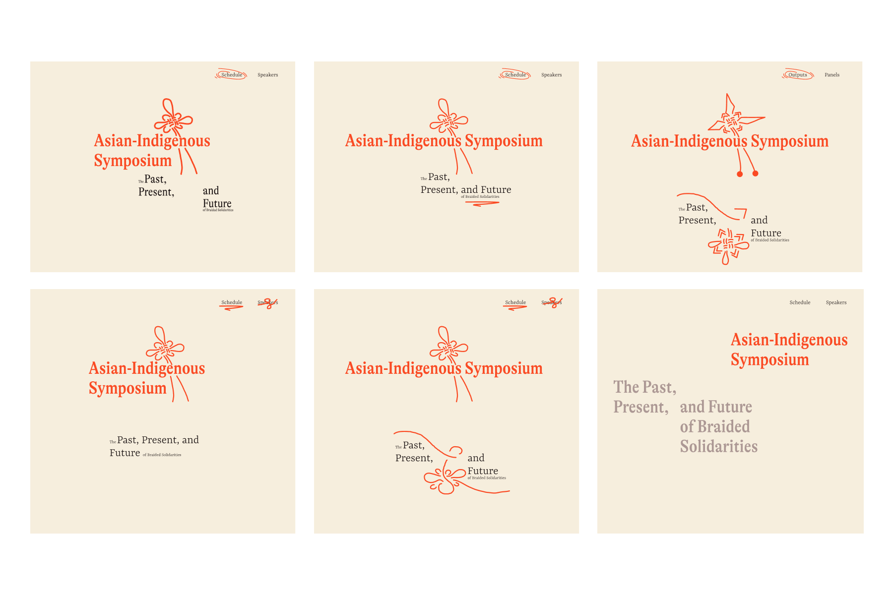
We began with the desktop site. Most attendees were community members, and most would read the conference information on a desktop. The first round focused on the layout.
Making Room for Both
During our weekly meetings, I flagged that the Asian elements were becoming more prominent than the Indigenous ones. We explored how to bring Coast Salish culture into the identity through basket weaving and whale imagery. The whale is a common figure in Coast Salish stories. We also consulted someone outside the team to check that our choices weren't reducing these elements to stereotypes.
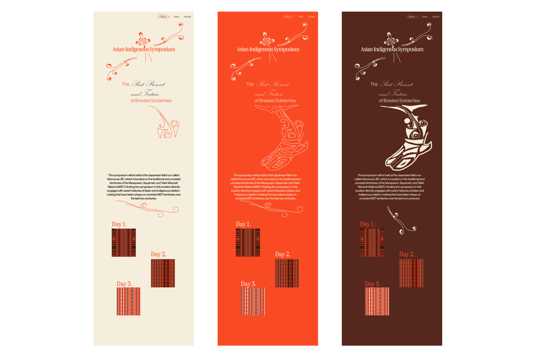
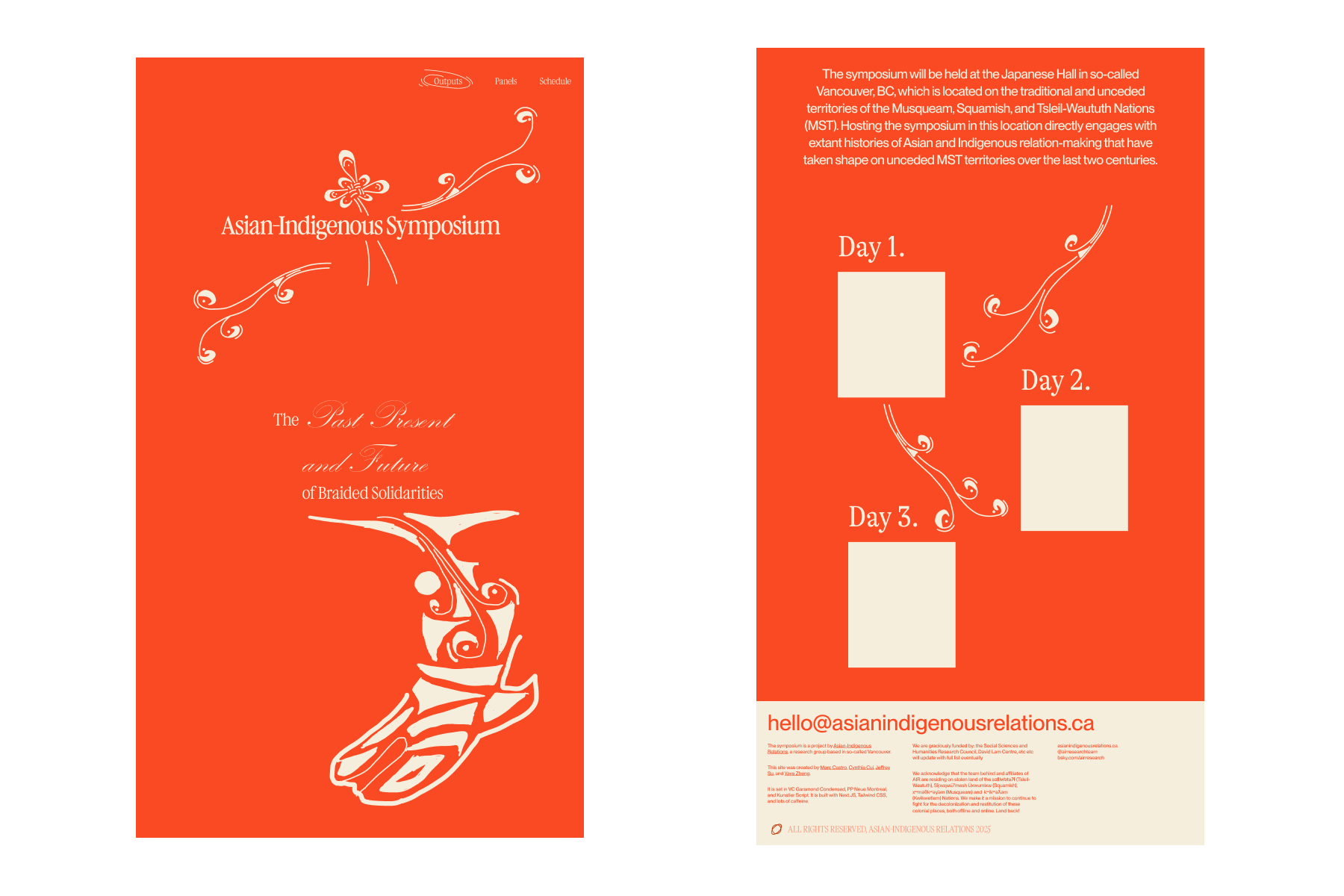
The final direction grew out of figure 6, which we felt represented both communities most evenly. We chose orange as the primary colour to keep attention on Indigenous communities' continuing work to make their histories and pain visible.
Brochure Design
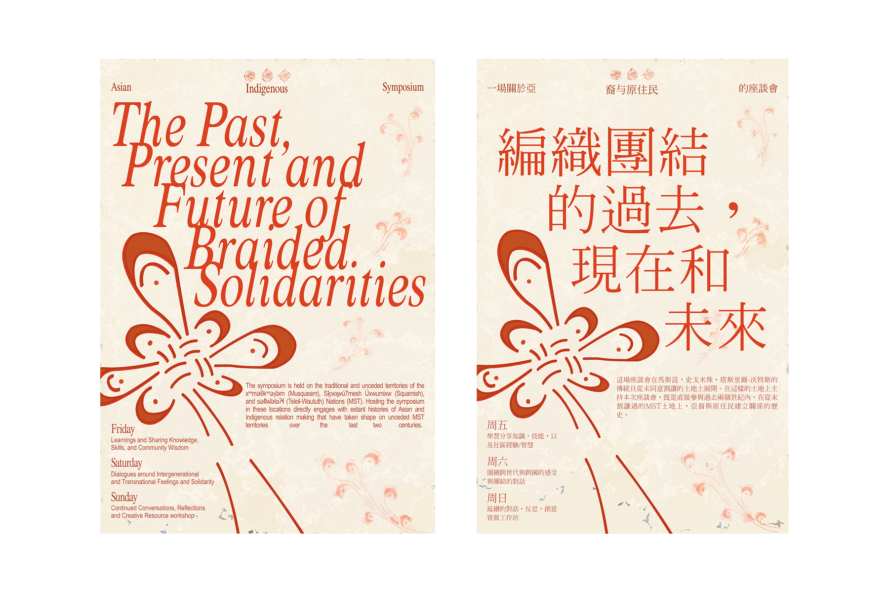
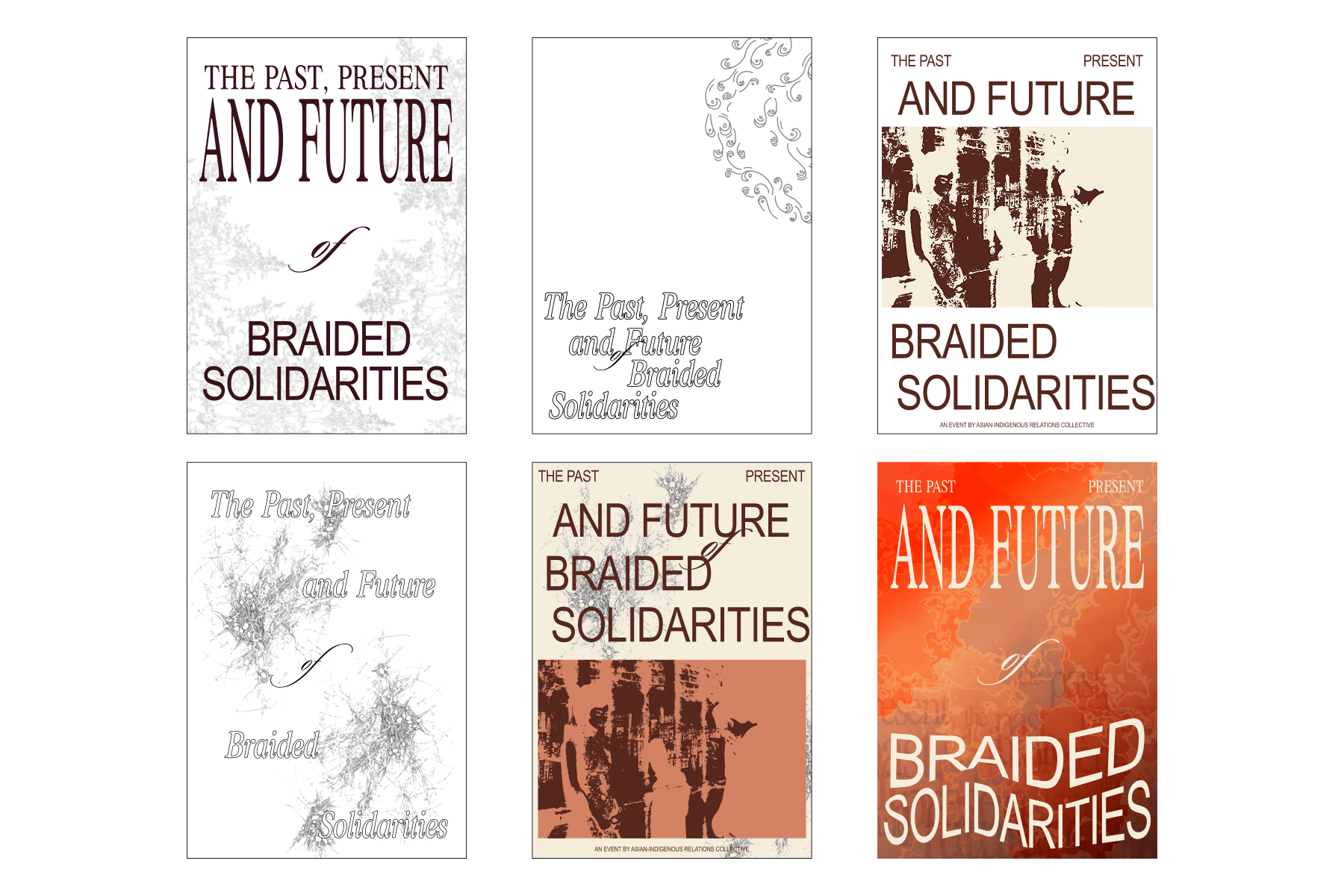
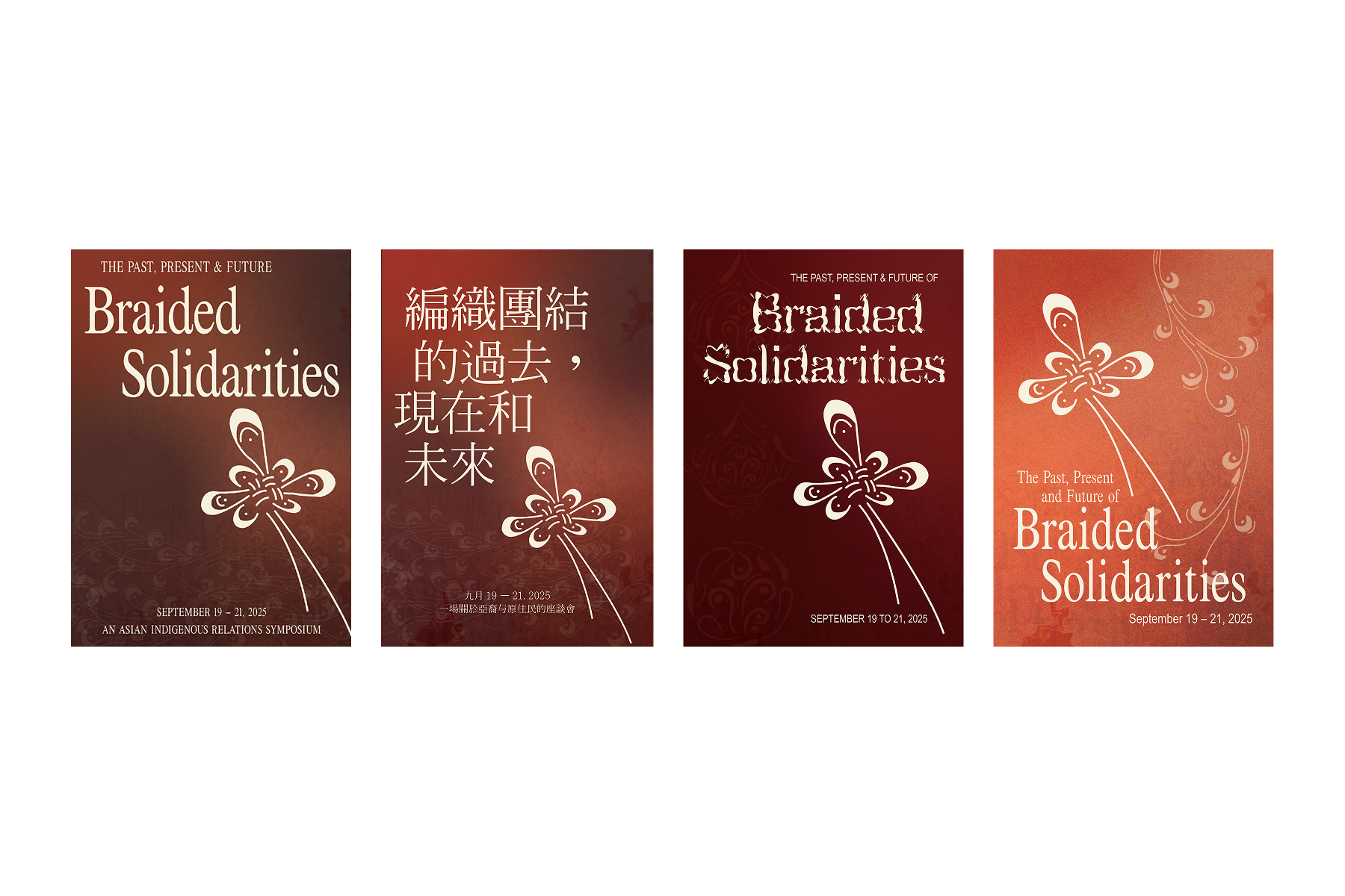
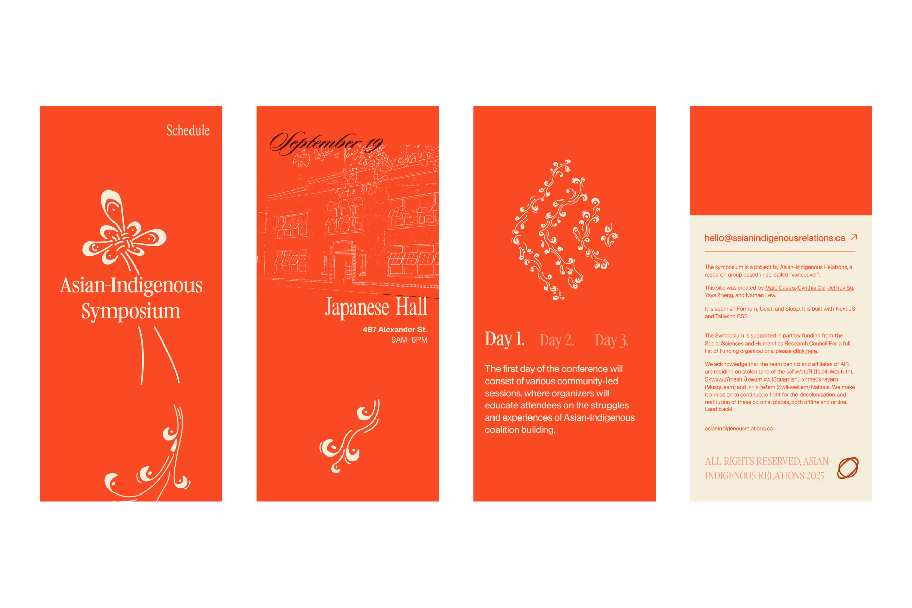
Once the site had a direction, I moved to the brochure covers. I used the early sketches to try different styles and structures, then developed the covers within our design system.
Two Languages, Two Palettes
Many attendees were Chinese seniors, so we prepared a translation of the brochure. That affected the typography too. The typeface needed to support Traditional Chinese characters.
I chose darker tones for the brochure because I wanted the printed pieces to have some independence within the identity. They didn't need to look identical to the website. The shared design system kept them related while allowing the printed materials their own character.
Design–Dev Handoff
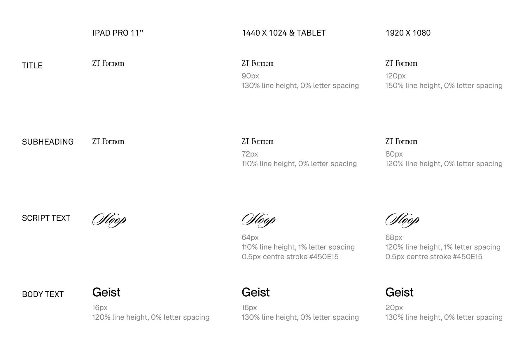
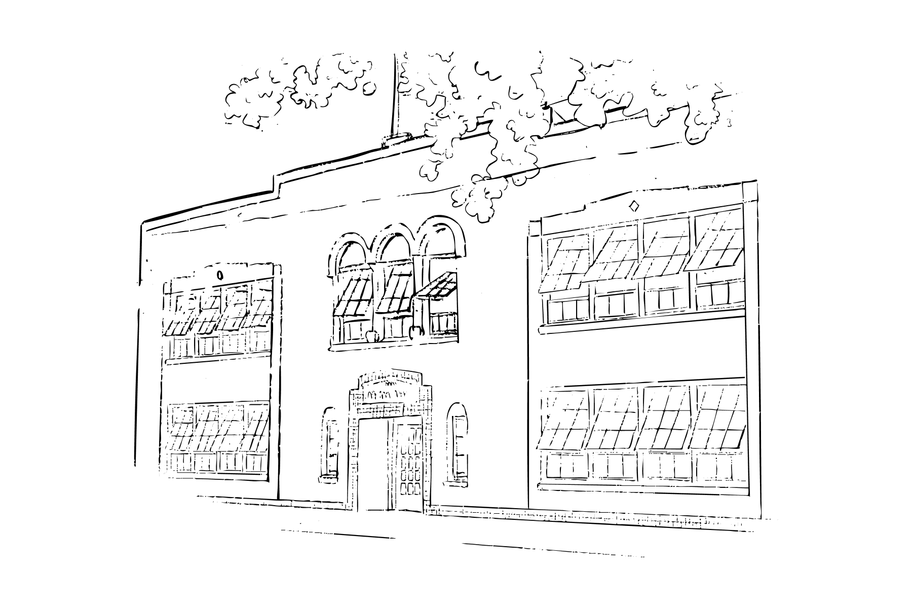
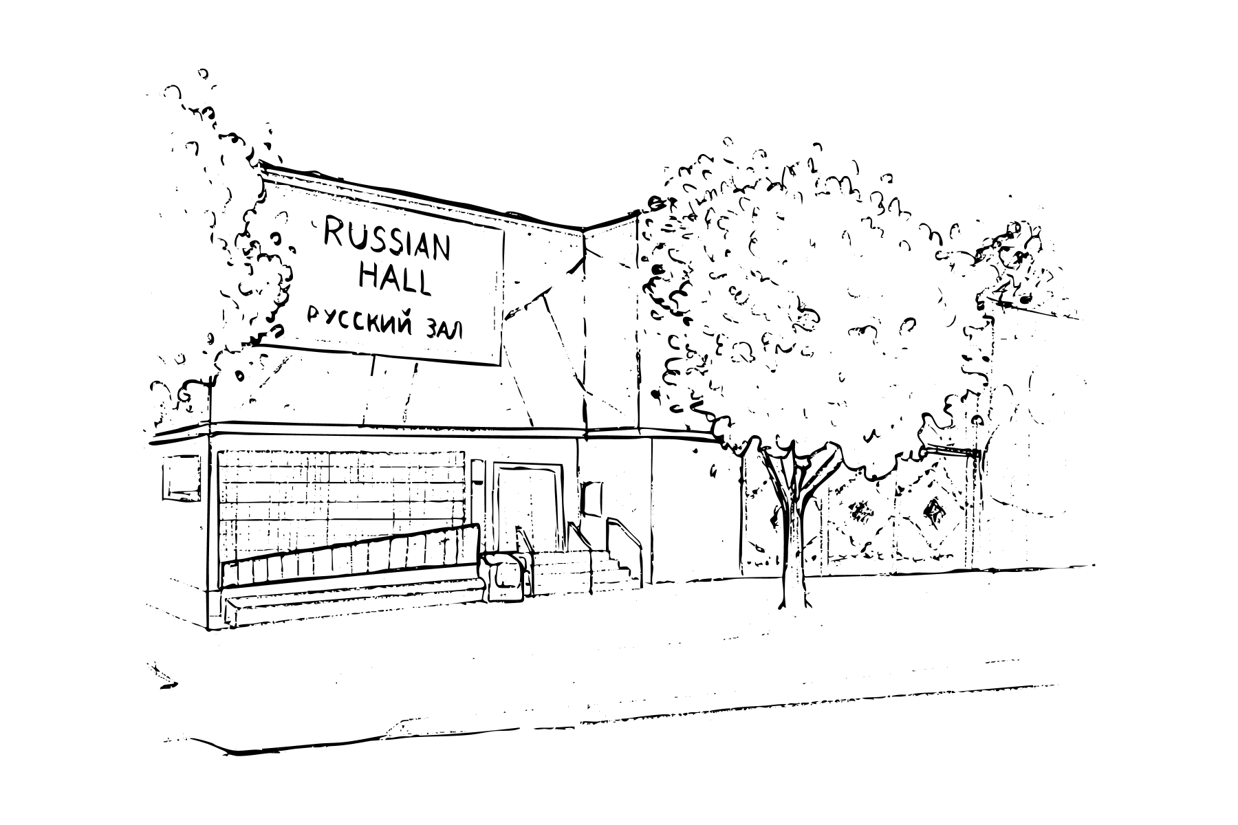
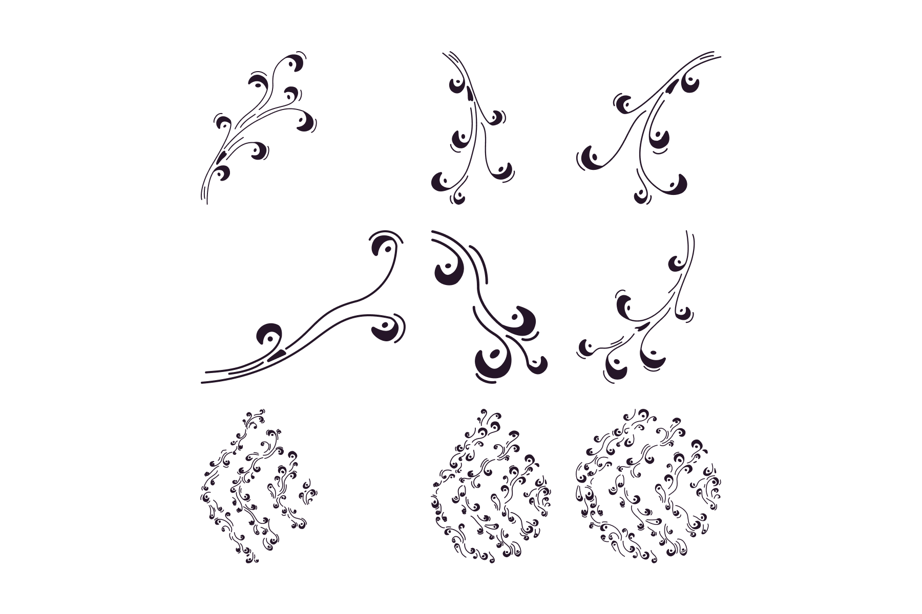
The website used animation and cultural motifs that needed to stay clear at different sizes. For the handoff, we documented the typography styles and hierarchy, supplied the visual elements as SVGs, and prepared mobile layouts for the responsive breakpoints.
The SVGs could scale and animate without losing quality. The documentation gave the developer a reference for carrying the design into the build.
Reflections
This project required us to keep revisiting how we represented both communities. Weekly meetings, design reviews, and outside consultation helped us notice when the identity was becoming uneven and change direction.
As the person leading the design team, I needed to leave room for that feedback. Our first direction didn't give both communities enough space. The later iterations came from working through that together.