

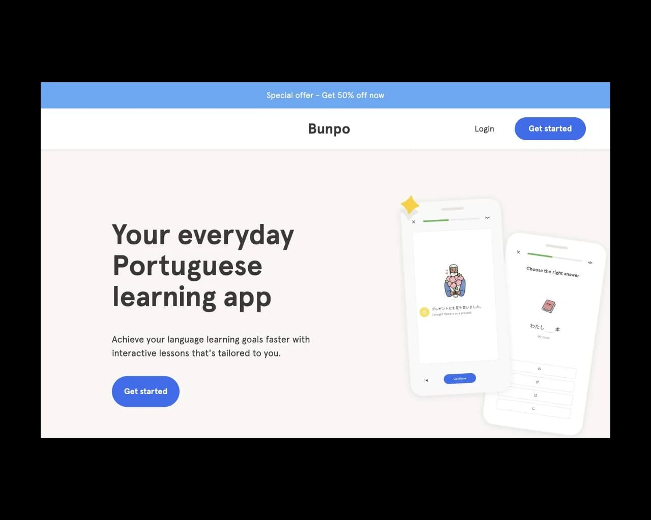

I've spent close to three years teaching myself Japanese, and Bunpo was one of the first apps I kept coming back to.
When it added Dialogues, Leagues, a redesigned home, and Monthly Challenges, I reviewed each one. This is an audit from my perspective as a learner and designer. The screens below are my proposals, with the original screens alongside them.
Dialogues
At an N5 to N4 level, I know some grammar but have few low-stakes ways to practice speaking or texting. Dialogues gives me a place to use what I've learned. It was the feature I was most curious about.
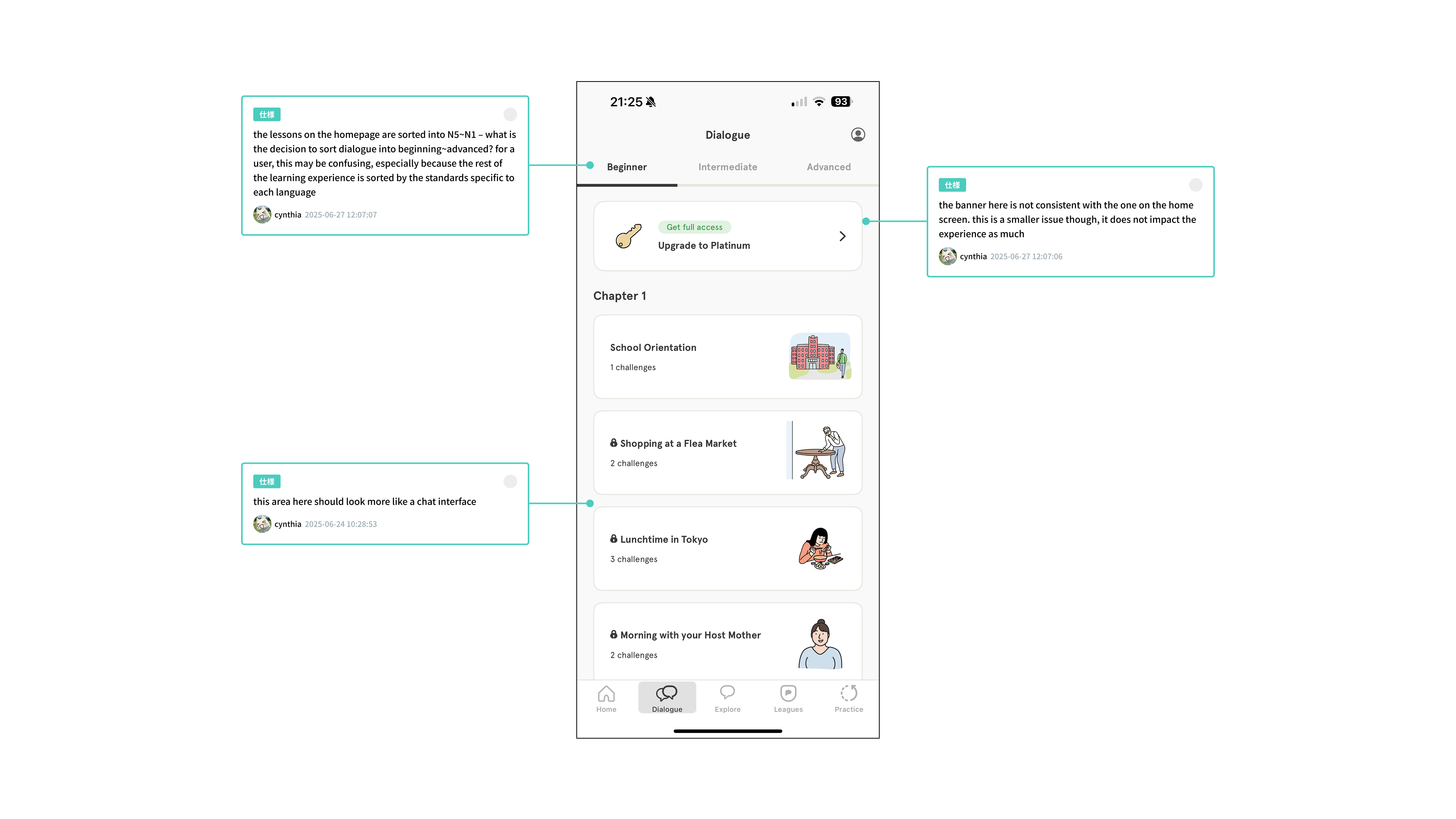
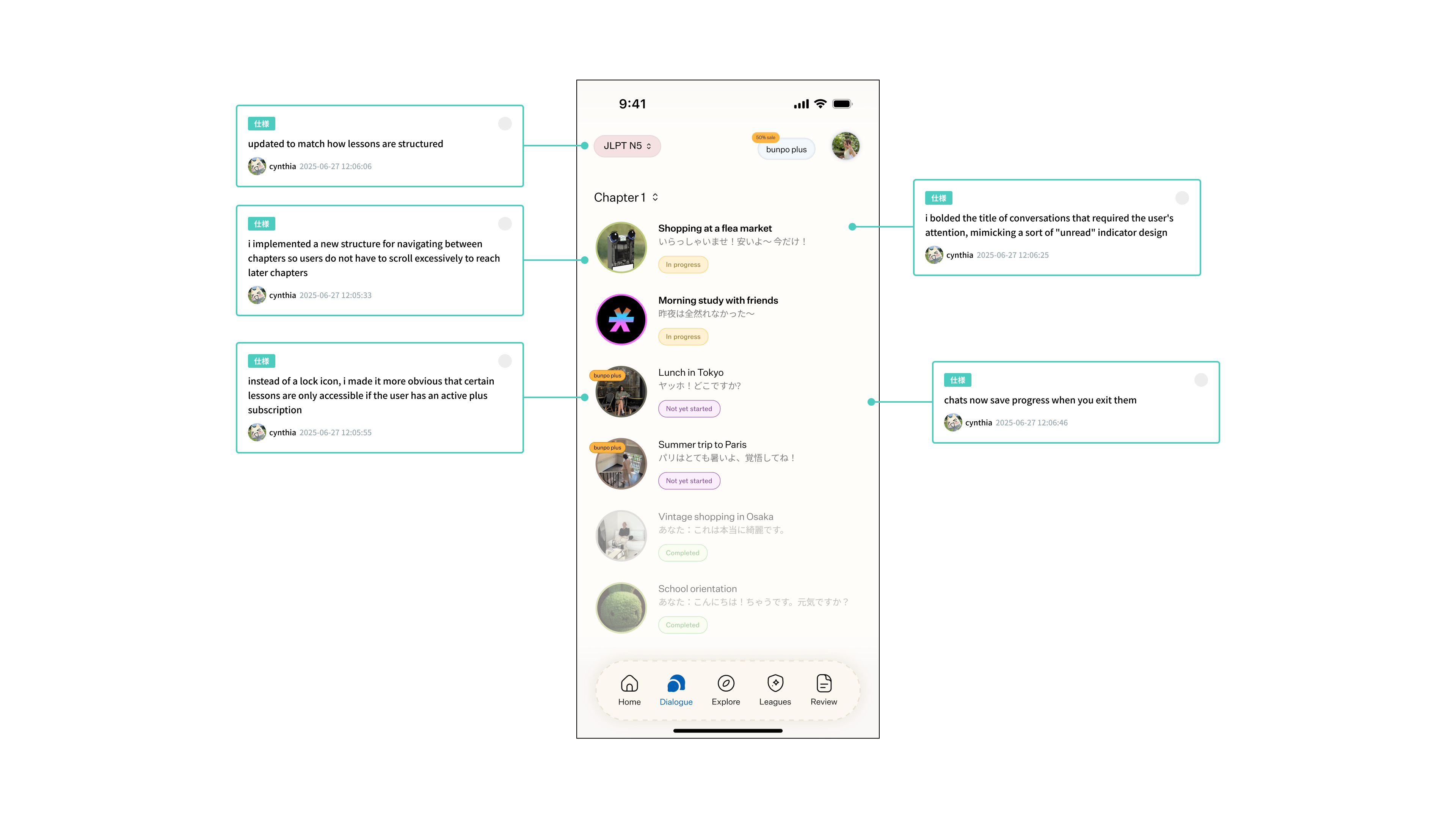
The overview looks like a list of lessons, though. I wanted the interface to make the conversational part more apparent before you opened a dialogue.
Pain Point
The overview presents conversations like lessons. It gives little sense of the exchange you are about to join.
Solution
I proposed a chat interface with familiar patterns from iMessage, X DMs, and WeChat.
Automatic Sorting
In my proposal, conversations would sort by when you last opened them. Tags would identify conversations that are in progress, completed, or not started.
Challenge Tracker
I would move the challenge tracker into each chat, where you are working on the challenge, instead of keeping it on the overview.
Pain Point
A pencil icon hides the sentence suggestion action. The icon doesn't explain what will happen when you tap it.
Solution
I would remove the pencil and cycle sentence suggestions inside the text input, where they would be visible while composing a reply.
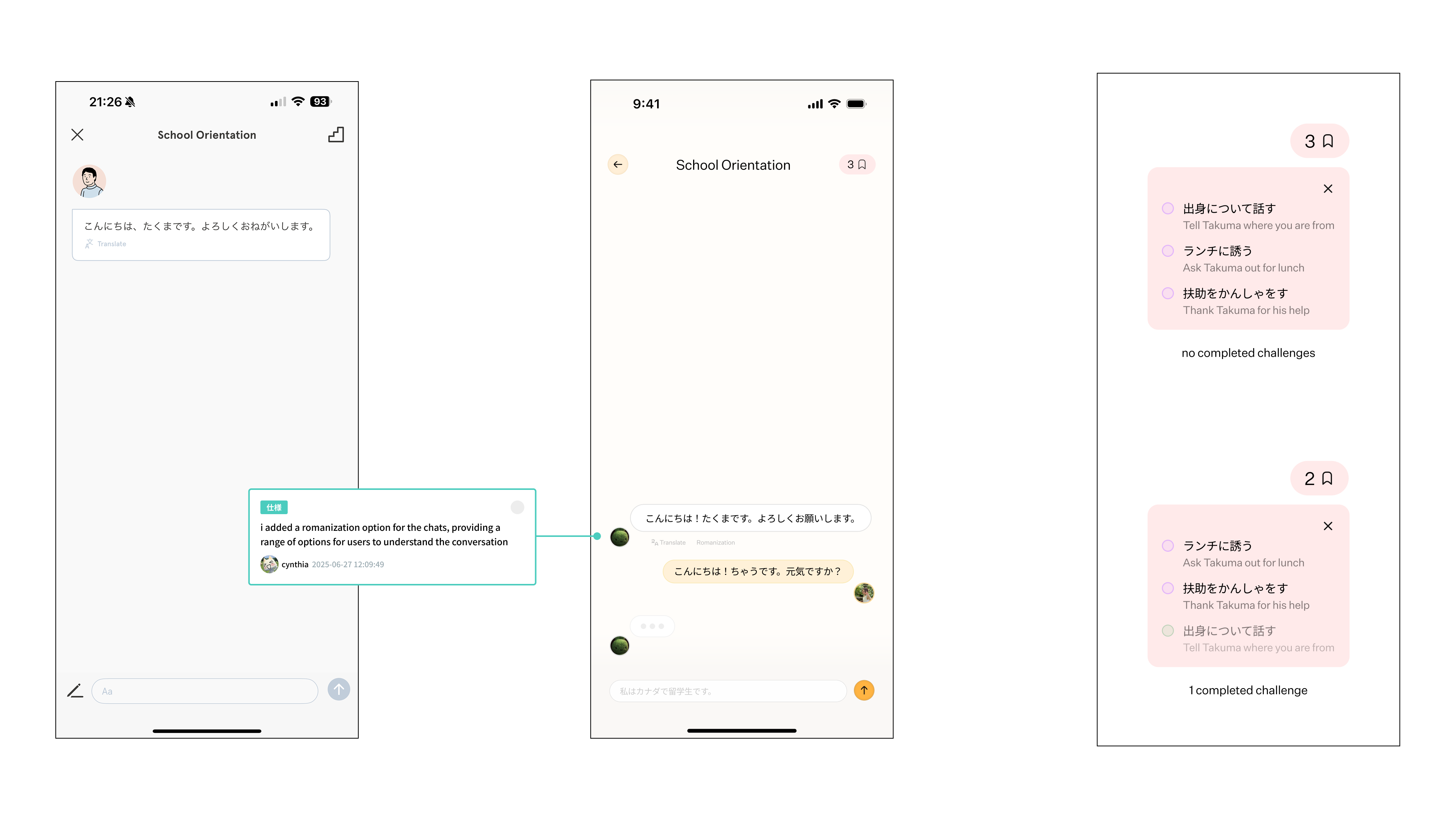
My aim was to make starting and returning to a conversation feel familiar. Whether that leads to more practice would need testing with learners.
Leagues
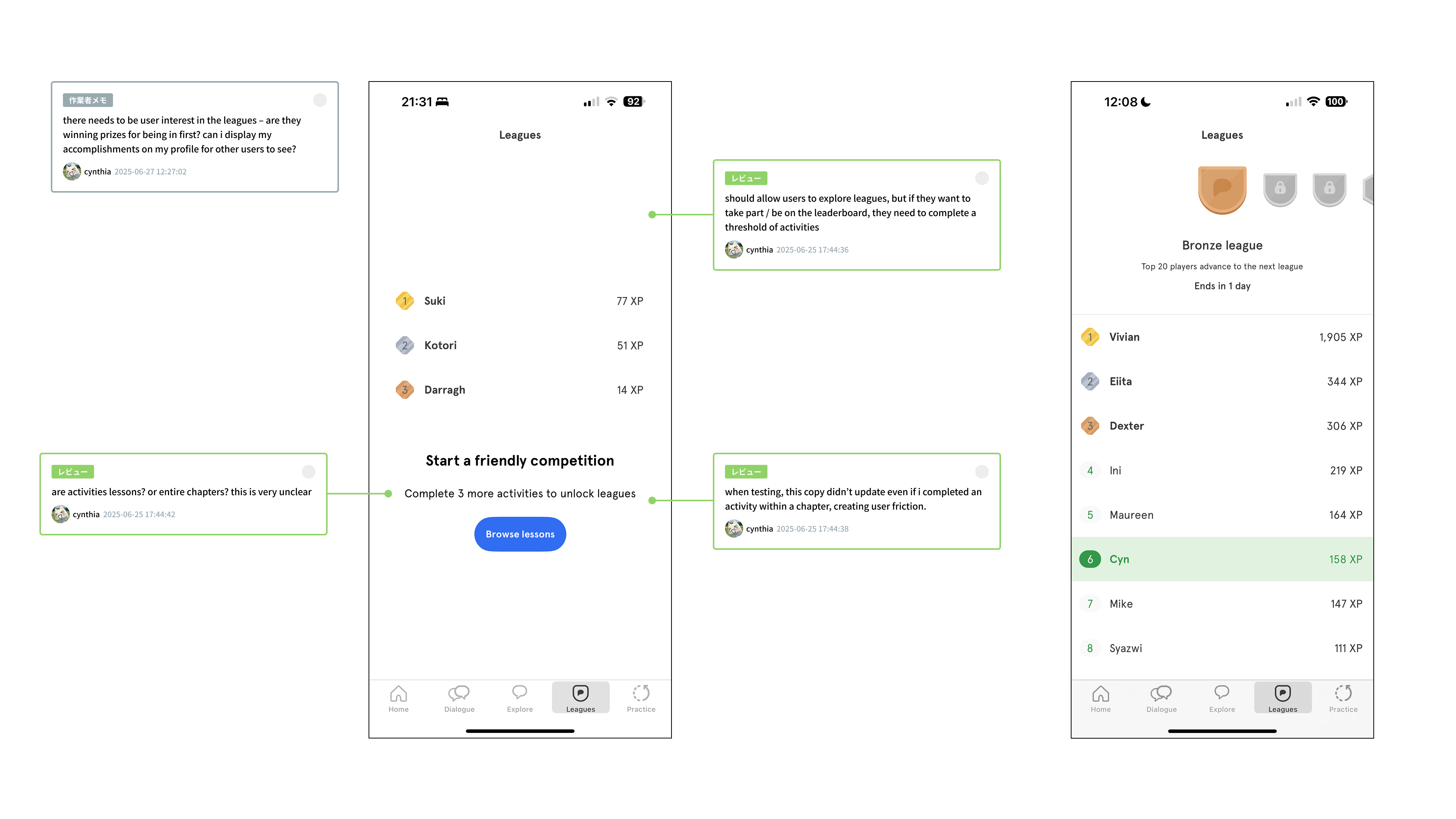
Leagues uses a leaderboard, much like Duolingo. It initially locks the feature and asks you to complete some activity before you can see it. That makes it hard to decide whether you want to take part.
Pain Point
The screen doesn't clearly explain the activity required to unlock Leagues or show progress toward it.
Solution
I would let people explore Leagues immediately so they can see what participation involves.
Pain Point
The screen gives little emphasis to the leading positions or the reason to compete for them.
Solution
I proposed giving the top three positions more visual emphasis so the league's goals are easier to understand.
Pain Point
A high ranking offers little reward beyond the position itself.
Solution
Coins, badges, or competitions with friends could give learners another reason to participate. I'd treat these as ideas to test.
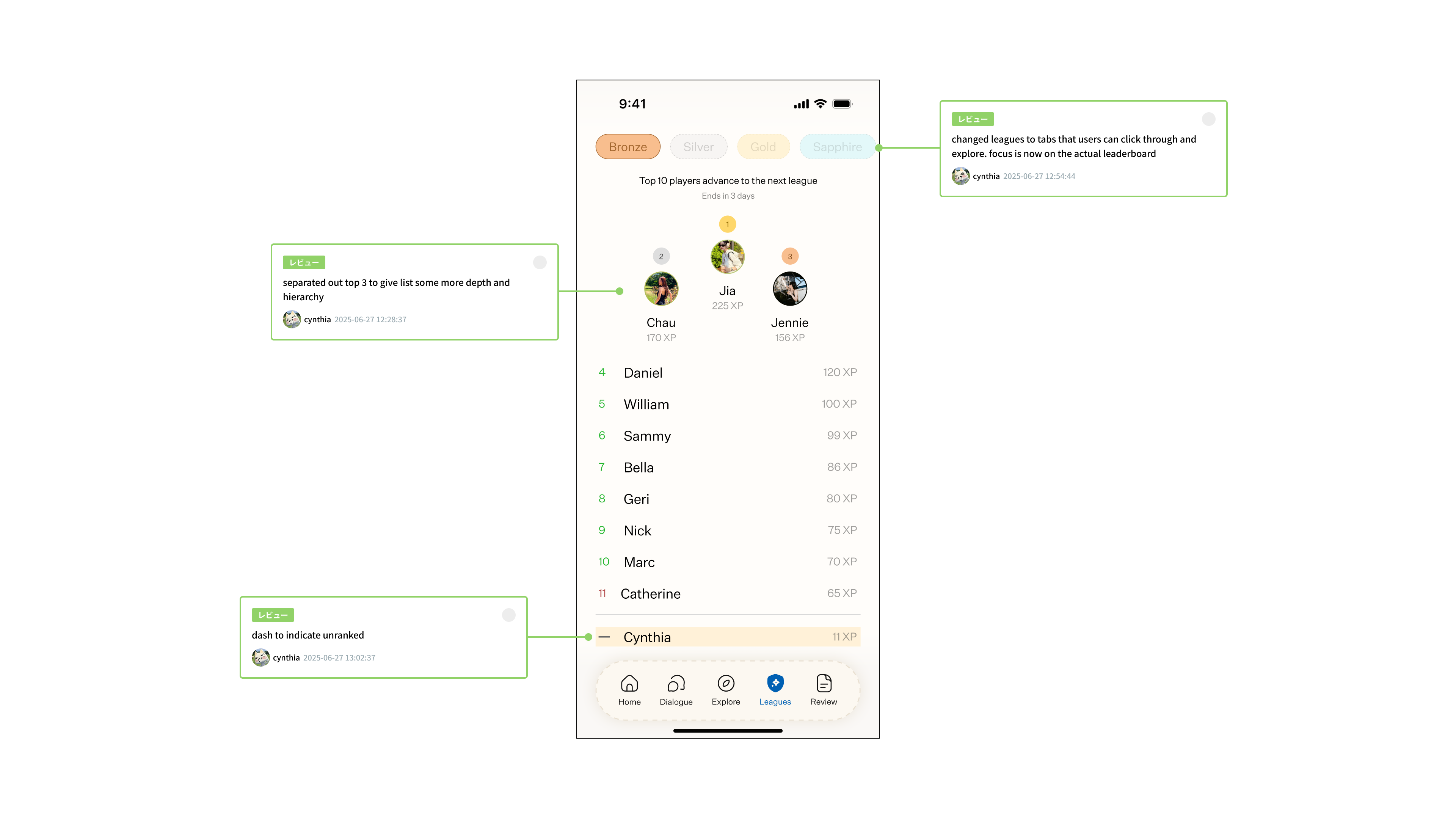
These changes would make the competition and its rewards more visible. I wouldn't assume that every learner wants a leaderboard, but those who do should be able to understand how it works.
Homepage Redesign
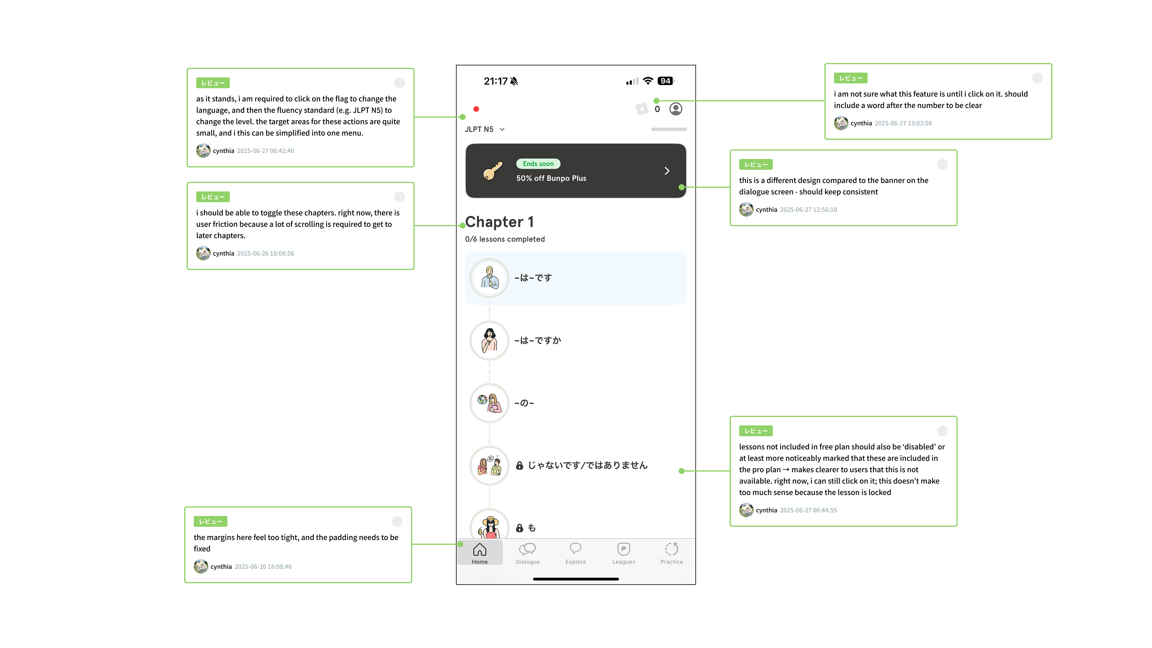
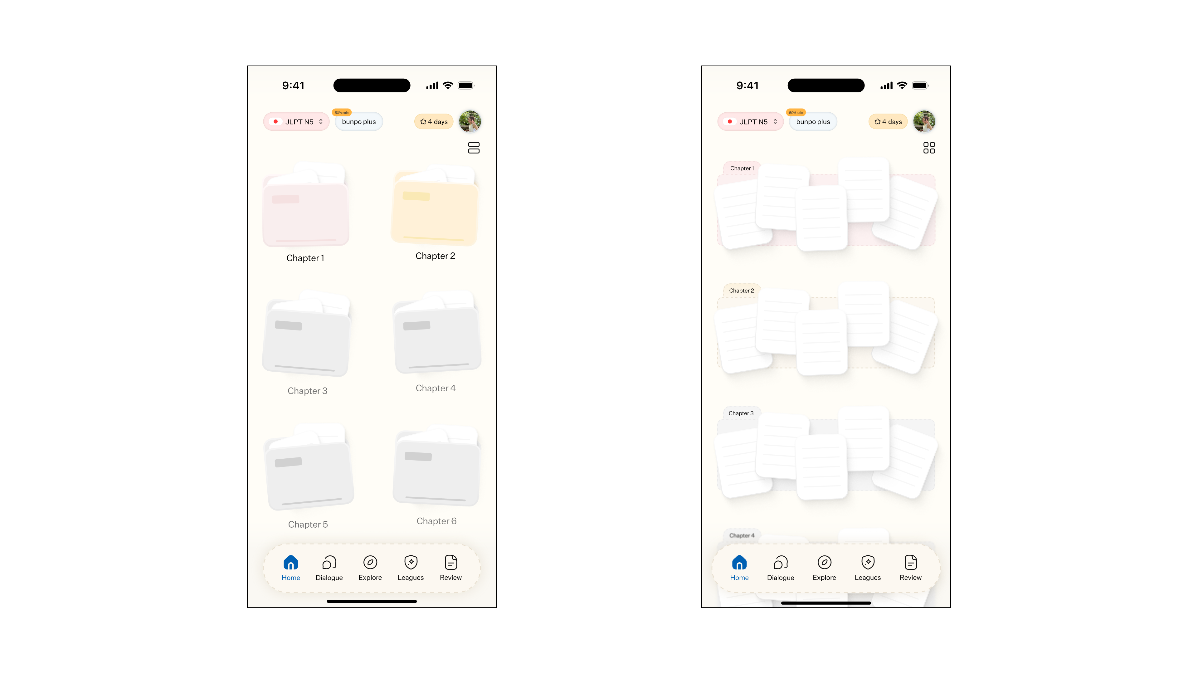
Chapters sit in one long list. Reaching a chapter means scrolling through the ones before it, even when you already know where you want to go.
Pain Point
The long list makes it difficult to find a chapter and see your progress across chapters.
Solution
I proposed a chapter grid with pink for completed chapters, yellow for those in progress, and grey for locked chapters.
Pain Point
The membership banner takes up space that could show more learning content.
Solution
I would reduce the banner's size to leave more room for chapters.
Pain Point
The language and proficiency controls are difficult to find.
Solution
I proposed a more visible picker for choosing a language and level.
Monthly Challenges
Monthly Challenges encourages a study streak through three types of challenge. I focused on how learners find the requirements and keep track of the medals they can collect.
Pain Point
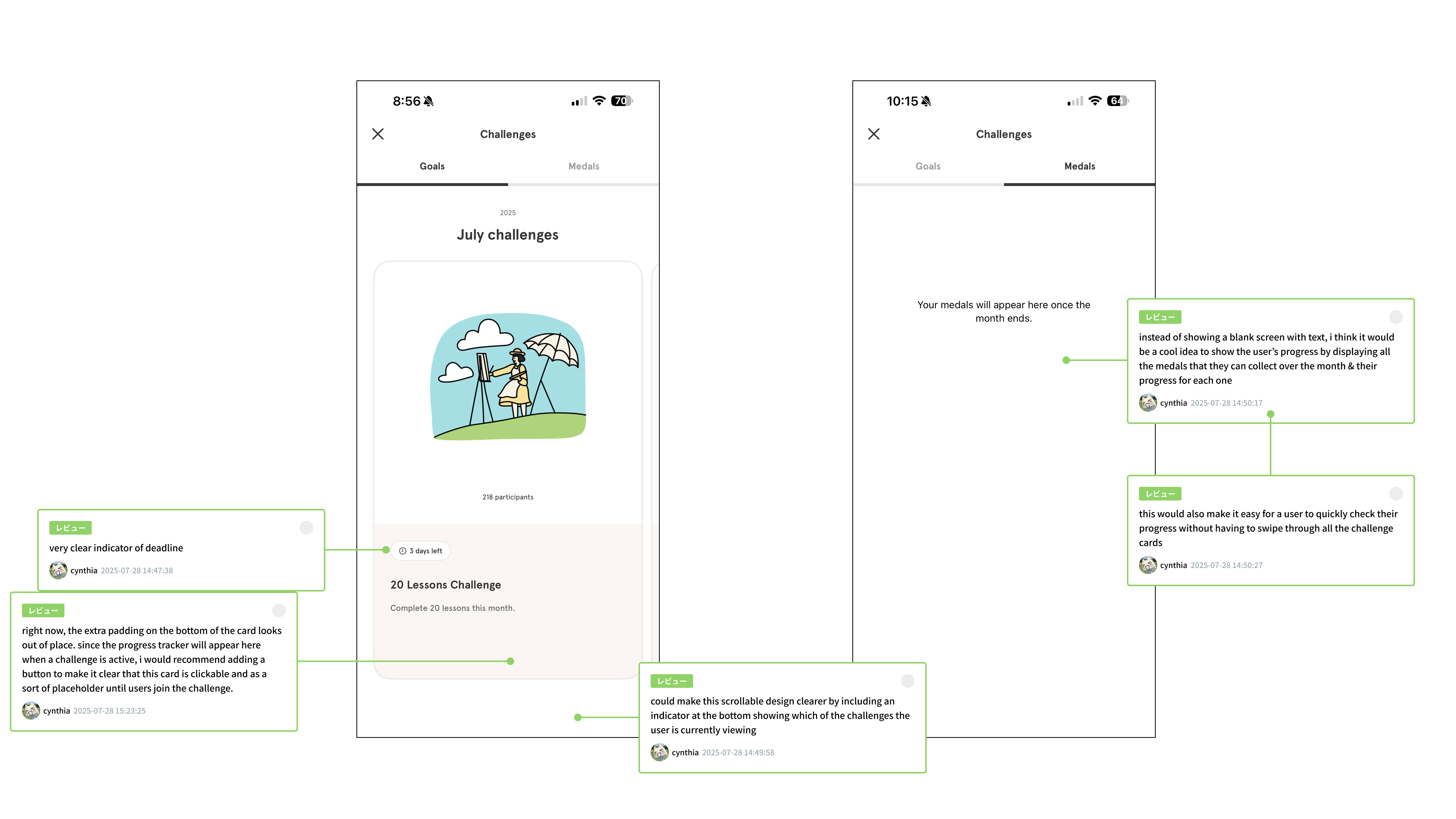
The carousel doesn't make your position or the available pages clear.
Solution
I proposed pagination to make navigation between challenge pages more apparent.
Pain Point
The collection screen gives little visibility to the medals available that month.
Solution
A dedicated medals tab would show the full monthly collection.
Pain Point
The challenge details are difficult to scan for requirements and deadlines.
Solution
I would separate dates, deadlines, and requirements into pills so learners can find each detail without reading the whole description.
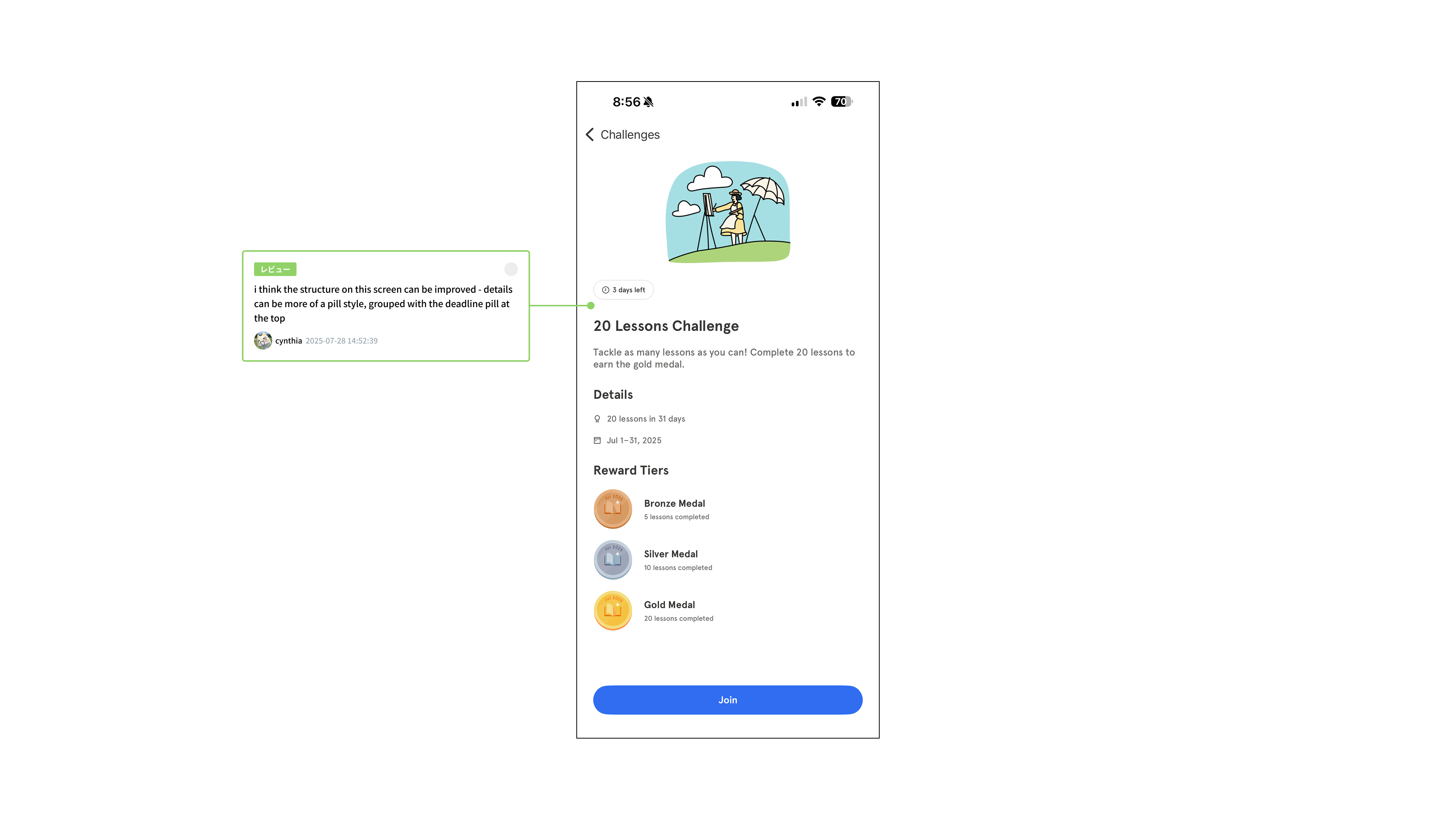
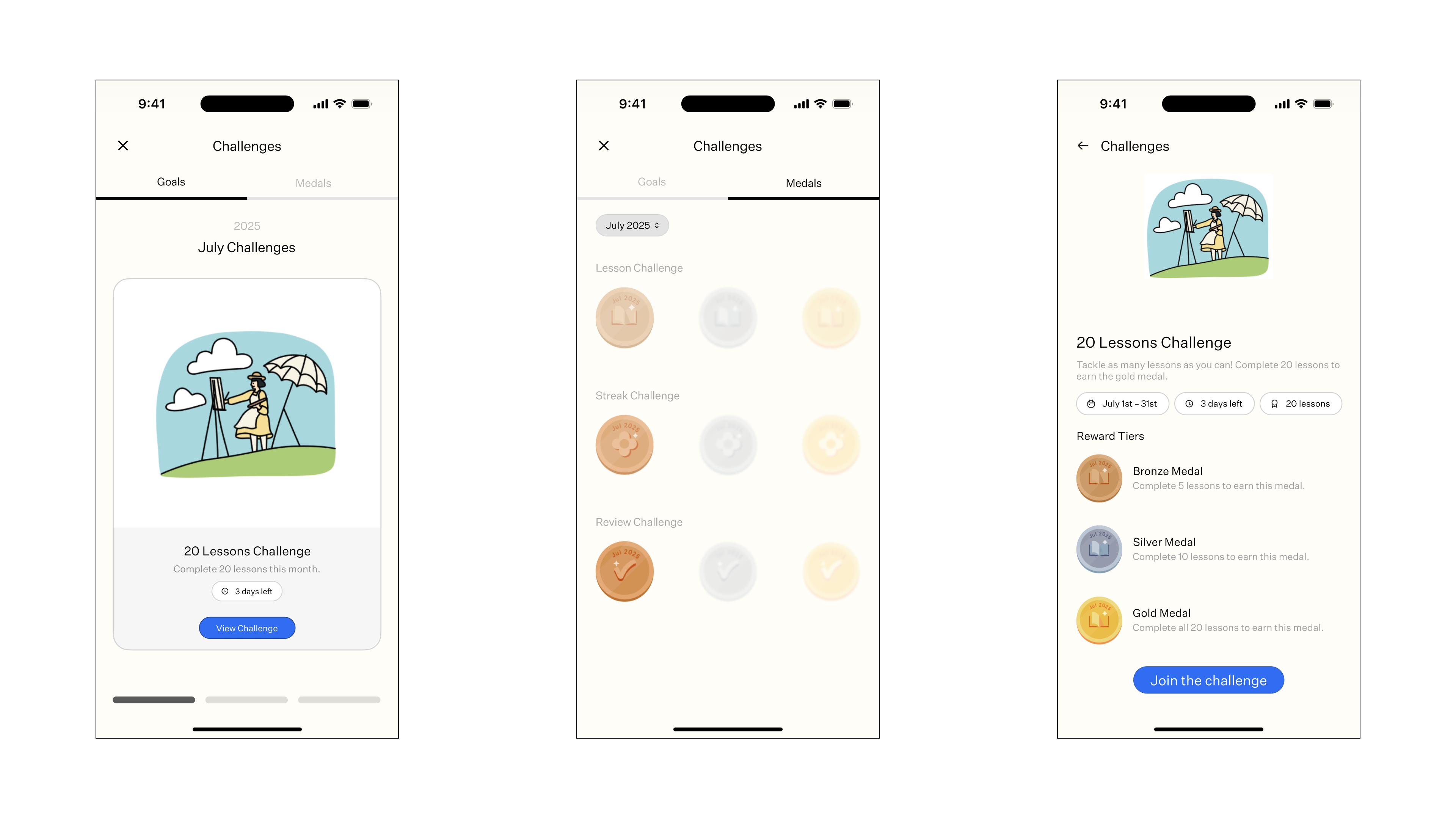
I kept the existing challenge structure. The changes focus on explaining the task and making progress easier to follow.
Takeaways
Across these features, I kept returning to the same questions I have as a learner. Where do I start? What have I finished? What am I working toward?
The proposals try to answer those questions with familiar controls and more visible feedback. I would need to test them with other learners before claiming they improve engagement or learning. My own experience helped me notice the problems, but it isn't everyone's experience.